
“Color is influenced by the surrounding background and lighting and all sorts of things,” says Shamey. “Even when you control all of these variables, it is highly subjective because our perception of color is a very personal experience. From the point of production, the question is: How do we minimize issues associated with perceived color? If you can generate it in an isolated environment, that’s all good and great, but the color is going to sit in a context. So how is that going to match in that environment correctly?”
Shamey says that a brand can come up with a color that matches another one perfectly in one scenario, then change the setting and it doesn’t match at all. “We call that metabolism,” he says. “A single color can flare or not match from one setting to the other, while some colors are more color constant than others. Some purples or olives, or some mixed like khakis—if you change the illumination, they can shift quite a bit, while others are less susceptible.”

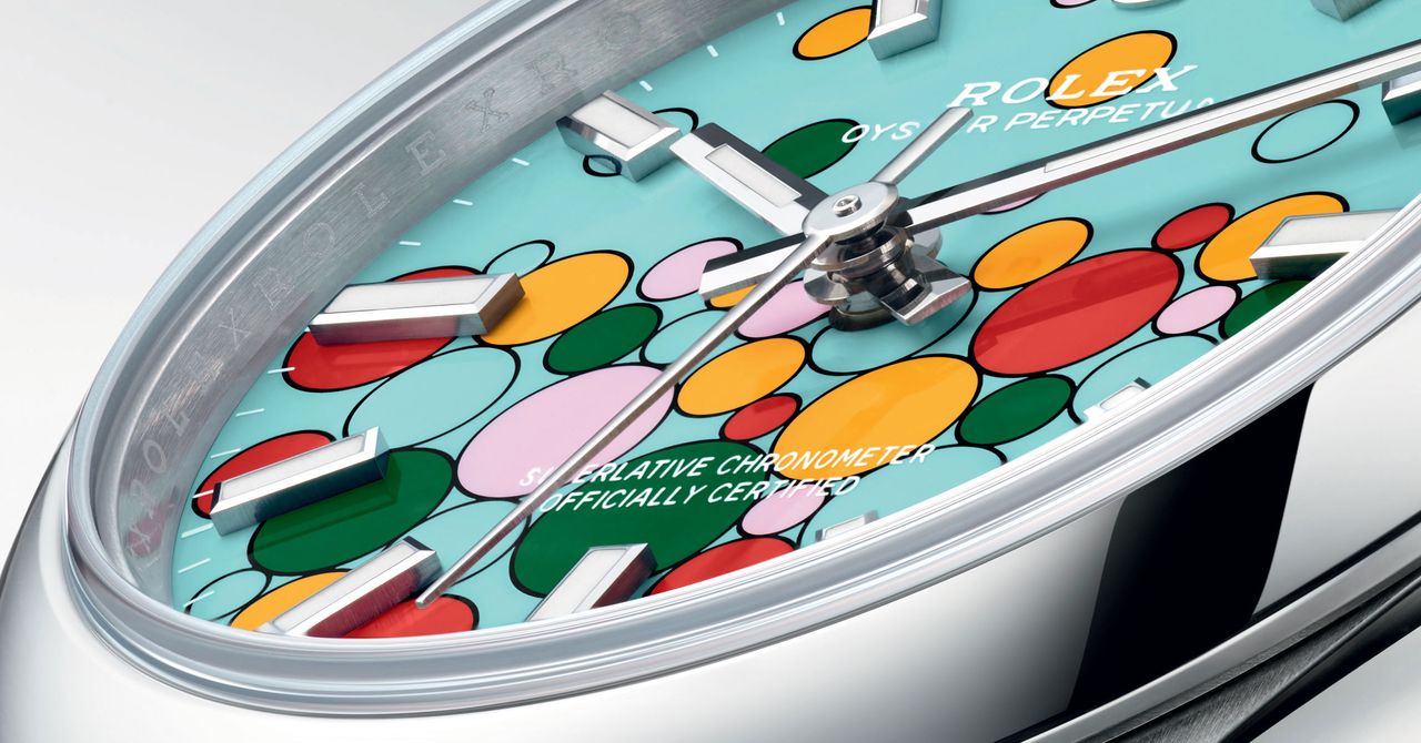
Across the watch industry, brands have reached for this type of pastel shade recently, with pale purples, pistachio green and sandy beige popular beyond Rolex’s 2025 Oyster Perpetuals. Whether the shift from more constant, solid, emphatic colors to those more likely to shift or metamorphose says anything about buying habits in the watch industry is for now a matter of speculation, but dials that appear to change hue under different lighting have long been popular with collectors.
However, those hoping for an updated reissue of Rolex’s Celebration dial my well be disappointed. The challenge of combining such pastels could mean the brand will think twice about repeating the bubbles trick with its current generation of shades.